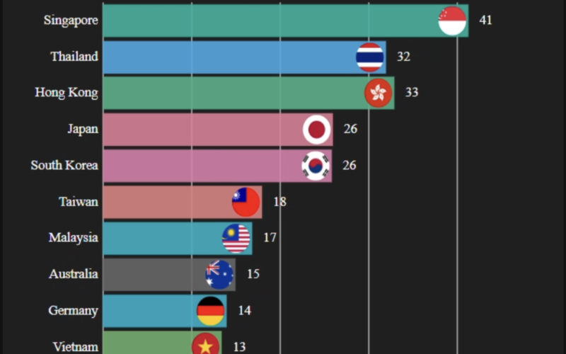
Bar chart race is popular in social media, it helps you visualize the change of trend over time
With over 100k confirmed cases of COVID-19, and 100 countries involved in this disease.
I decided to visualize the outbreak for countries outside of Mainland China from 27 Jan 2020 to 19 March 2020.
If you want to explore more about the trends in COVID-19
I’ve made a COVID-19 LIVE Interactive Dashboard. You can filter the country/province to have a custom view of all the charts available.
Tutorials and upcoming projects
If you don’t want to miss out on any tutorials /interesting projects that I’m working on, Subscribe to my FREE Newsletter below.
All the servers and hosting are maintained by myself alone.
If you like my work, you may consider buying me a coffee to help me reach my goal, thank you!


2 comments
Fantastic site mate alot of work into this! Thanks.
Howdy! Thiѕ iѕ kind of off topic but I need some help from an established blog.
Is it very hаrd to set up your own blog? Ι’m not
very tecһincal but I can fіgure things out pretty quіck.
I’m thinking about creating my own but I’m
not sure wherе to start. Do you have any ideas or sugցestions?
Many thanks